Opening the Digital Interior: The Infinite Display
#DesktopExhibition
With their progression of hierarchical rooms, grand Elizabethan homes were seen as microcosms of society. You’d start in the great chamber, which was the main reception room used to host banquets. After the great chamber were two further rooms into which guests might be invited. First was the semipublic long gallery, which was usually crammed with extraordinary portraits. Next was the most exclusive room of all: the withdrawal chamber. More commonly referred to today as the “drawing room,” this is where one might withdraw from the “common herd” and be among the intimate circle of the owner of the house.
Today, as in Elizabethan times, not just anyone is welcome into one’s personal, intimate space—into their interior. Our digital devices have also come to feel like private spaces, full of rooms (folders) leading into other rooms (subfolders), some of which we choose to show, and some of which we choose to hide.
The tension between private and public spaces becomes clear in my work. To me, making exhibitions is a practice that uses four characteristics of design: objects, symbols, interactions, and environments that meet a theme. I have tested these characteristics in physical space, particularly between 2011 and 2017, as cofounder and artistic director of Depot Basel, a place for contemporary design in Switzerland. (Since 2011: 357 designers, thirty-five projects, one Depot Basel.) There, we were concerned with implementing design-specific, contemporary topics in corresponding existing formats as well as developing new formats and content that was interesting and accessible to both a broad and specialist audience. To do so, we developed countless experimental formats. I have since been entrenched in the concept of private and public display.
A Depot Is a Space in Which “Things” Are Stored
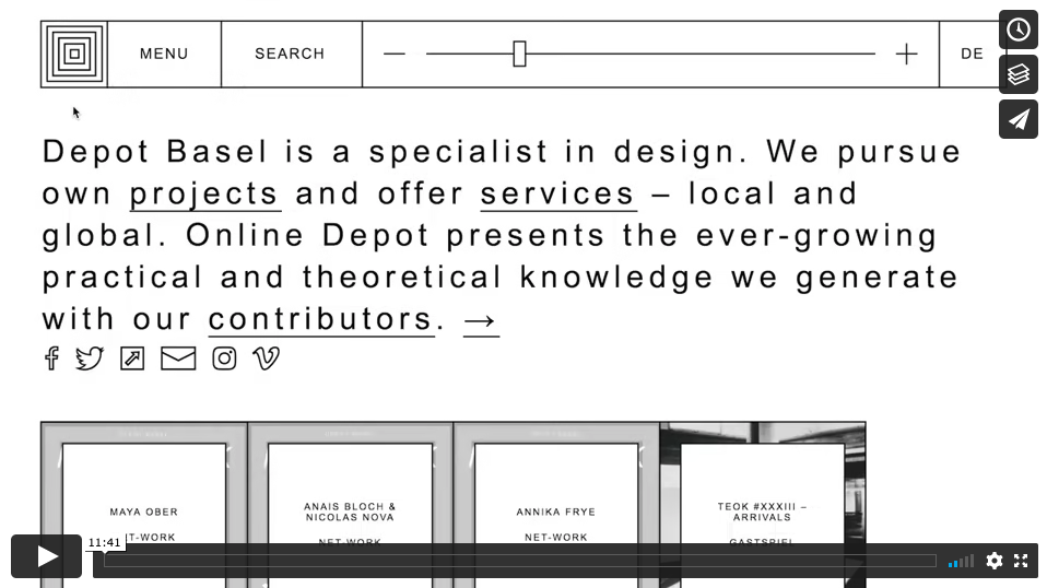
Interest in the digital space came naturally to me. Depot Basel used various social media tools for communication, and we realized that we could develop local projects and make them visible to a global audience if we operated with formats that work online. Online Depot, Depot Basel’s online archive, was one of them. I worked on the overall concept and strategy, supported by Depot Basel members Rebekka Kieswetter and Heidi Franke, with frequent critical and expanding feedback from our board and external board. We also worked with graphic designer and programmer Luke Archer when he was with the Lausanne-based Omnigroup.
The reoccurring question was: Why a depot? Our first temporary location was an 850m2 former grain silo in Basel. The name was relational and responded to the place where we started. A “depot” is a space in which things are stored. But a flexible and dynamic place like Depot Basel has never had enough storage space for all of its contents: exhibitions, lectures, catalogues, get-togethers, and other on-site formats. We wanted to make our acquired knowledge generally and comprehensively accessible and reusable, to keep the “stock” alive. We created virtual common rooms analogous to the physical location—an endless, interconnected scroll. Scrolling through the contemporary discourse as if walking through an online exhibition, we stored virtually in order to satisfy the numerous inquiries about past content and current interest and to be able to work actively with our “inventory.” We aimed for the depot to function as a digital warehouse for contemporary attitudes around design, and we won the Swiss Design Award for Mediation in 2017.
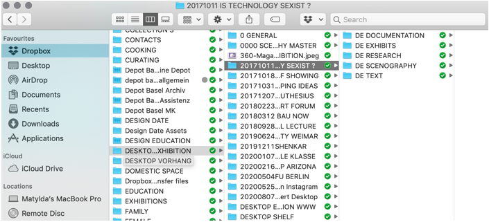
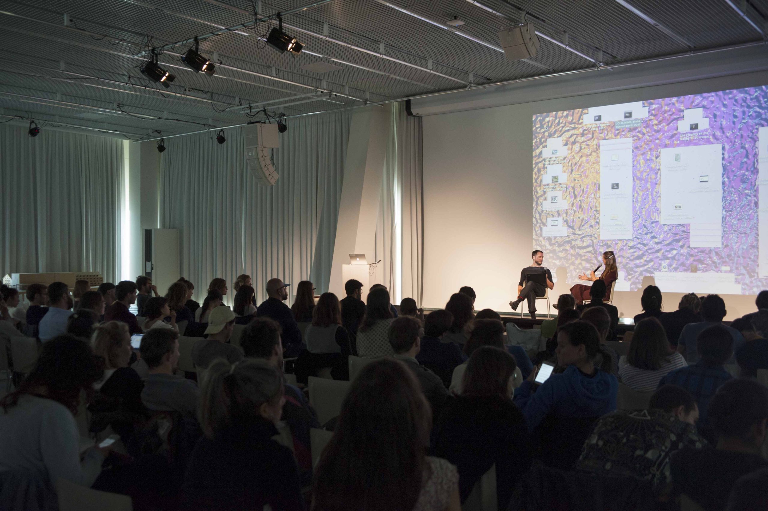
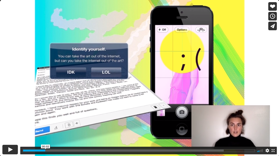
Developing Online Depot sparked my interest in testing and expanding the idea of what digital-format exhibitions could be—perhaps reflecting how I’ve always used the desktop quite dynamically, constantly rearranging my files and folders and frequently changing my wallpaper. At that time, Chus Martinez, head of Institut Kunst at Academy of Art and Design Basel, and curator Elise Lammer asked me to speak at the Is Technology Sexist? symposium (October 2017) at Institut Kunst. I readily agreed, but I just couldn’t do another PowerPoint presentation and instead organically composed the first Desktop Exhibition. It was similar enough to the curator’s established method of operating: first distributing things in a space and then walking through it, pointing at exhibits, and explaining what they are about.
When Someone Beams the Desktop Right into Your Human Retina
I call this nonlinear format “Desktop Exhibition.” It is complex and dynamic. It offers access to every file I have, making it an endless rabbit hole that can also expand into the internet. “A Desktop Exhibition is when someone beams the desktop right into your human retina,” web designer Christoph Knoth says of this work.
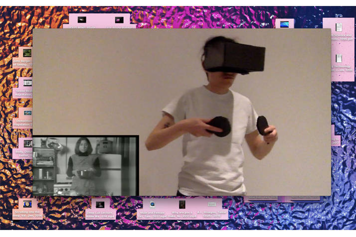
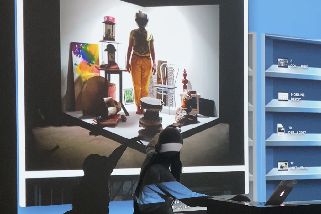
This format is not flawless. In fact, it’s quite clumsy. I can respond but not dictate. But, as opposed to ordinary (PowerPoint) presentations for which a linear series of slides has been prepared and will be recited, this format allows for adapting to questions and interruptions and gives space for tangents and impromptu anecdotes. In the Desktop Exhibition, I click through files on the desktop—JPGS, text files, videos, Sticky Notes, screenshots—in a manner akin to walking through a physical space and guiding visitors through an exhibition. Aren’t files also working artifacts that can be displayed and discussed? In the Desktop Exhibition, I show existing work from all kinds of disciplines. Sometimes I present my own work, and other times I develop themed exhibitions for which I ask other practitioners to produce an exhibit. The production of the exhibits takes place in the same workshop space as the presentation: on-screen. For Is Technology Sexist?, artist and designer Jing He built a VR set out of cardboard and filmed herself controlling Martha Rosler’s movements in Rosler’s 1975 piece Semiotics of the Kitchen. Writer and critic Tamar Shafrir sent me an email about Emma, the AI Gender Voice: “If our bus is diverted to a new route, we assume that Emma will sort it out for us.” And designer and founder of the queer, intersectional feminist platform Futuress, Nina Paim, screen-recorded her browser window looking for answers to “Is Google Sexist?,” googling for images of what the terms “doctor,” “engineer,” and “babysitter” offer to reflect the sexism ingrained in algorithms that present only male, white bodies by these words. As a by-product of our times and the digital nature of these collaborations, the transport routes for the Desktop Exhibition are quite sustainable and low cost in comparison to a standard exhibition. At the end of most Desktop Exhibitions, I share a WeTransfer link with the audience and invite everyone to download the show for themselves.
Totality of Work
Comparisons between Desktop Exhibitions and La-boîte-en-valise by Marcel Duchamp are often raised—most recently, by the art historian Dr. Anna-Lena Werner, who invited me to speak at her seminar at Free University of Berlin. She aptly called the occasion of invitation “Design: Spatial Projects in Digital Worlds.”
Duchamp’s piece is a small leather carrying case that opens up into a tiny exhibition of his work, complete with folding frames and consisting of little replicas and reproductions. Between 1935 and 1941, Duchamp made a limited edition of twenty boxes, each with slight variations. As Tudor Davies, Christie’s head of impressionist and modern art in Paris, says of the work, “This museum-box concept [ . . . ] reflects his continuing exploration of this idea of what constitutes an original [ . . . ] Duchamp decided he would be the first artist to curate his own retrospective, but conceived [it] as a new work itself” (Christie’s n.d.).
You Can Bring the Exhibition to Any Place
Duchamp’s case full of miniatures is seen as a work of art. Not just because it is a collection of objects created and assembled by an artist but also because of its totality as a performative, portable, and thereby accessible—even humble—personal museum. That the original works themselves and the collection are considered works of art naturally sparks one of many discussions relating to originality and whether the original is needed to mediate its meaning.
In a voice message Anna-Lena left me on WhatsApp, she elaborates on the Desktop Exhibition: “You are using your own desktop of your laptop as a substitute for the traditional white cube space. Maybe even helping to demystify it. [ . . . ] When you perform the exhibition, your desktop is a place of order. And you can bring the exhibition to any place.”
I found it relevant because in this format, the work that I show—the exhibits—culminates in a totality that is an organism of its own. The little boîte that I carry around is my laptop, and by opening it up in public, I’m allowing people into my digital interior. It’s a lot like inviting people into my front room, or—in Elizabethan terms—my drawing room. It becomes a portable, personal museum of sorts.
Digital Exhibitions Allow Everyone to Participate
Portability and relatability grow more important as the threshold for entering a museum is seemingly getting higher, not only due to museums’ increasingly extravagant—possibly forbidding?—architecture. Kristen de la Vallière, founder of say hi to_, the curatorial platform for contemporary design, brought up the urgency of accessibility and of lowering the fear of contact. When I asked her in an email what she made of the various digital exhibition formats that have arisen in the past few years, she replied:
"They democratize culture and make these domains accessible to a larger population outside of an elite inner circle. I thought back to growing up on Long Island, where most people would have thought that Picasso was either a musical instrument or a pasta sauce—where only 'rich snobs' went to exhibitions or art museums. Until I was in a university setting, I had zero access to art or design. I realise now that digital exhibitions allow everyone to participate."
The lowering of the threshold also comes with the elimination of transport routes for exhibits, curators, and visitors.
Musing #1: An Economy Driven by Presentation: The key elements of the Desktop Exhibition are the elements ordinarily attributed to performance—scenography, choreography, and gesture. The Desktop Exhibition, whether online or in person, is a narrative/storytelling format that constantly adapts to its contents and contexts and is best experienced live. As with most things performative, the Desktop Exhibition exists in an ephemeral moment, but traces of it—ideas, thoughts, quotes, screenshots, recordings—are left behind. And, as we know: the internet never forgets.
This idea of traces left behind by things (re)moved makes me think of the artist book Shadow Architecture by urban planner and architect Aleksandra Wasilkowska. Aleksandra looks at the physical traces of the shadow economy in spaces occupied by street markets and street vendors that architects have largely ignored. Her term “shadow architecture” refers to the spatial structures that elude central planning—carts, kiosks, tables, plastic boxes, and stalls. The economy I am operating in on the desktop is driven by presentation with items that also elude central planning: files. They can be moved and stored but also only really exist as a trace of an idea in the audience’s minds.
#ShadowDesign: It’s a bit like the tension between ephemerality and permanence in old paint on canvases, which, through age or restoration, reveal the initial layers of paint below and a painter’s errors or change of heart. This aging process is called “pentimento,” which comes from the Italian word for “repentance,” or “to repent.” This reminds us that beneath any painting lies the original canvas, a base transformed, a mind changed—stories erased but not gone. Files shared and not forgotten. Could the term “shadow design” represent that?
Musing #2: What Is Real?: The pioneers in the digital realm were also naturally predisposed to drawing from “real life” when it came to the terminology or symbolism of the digital sphere—desktop, mouse, hourglass, sticky notes, recycle bin, notepad. You’ve probably read or used the acronym IRL (in real life). In episode 92 of the podcast Darknet Diaries, Peter Sunde Kolmisoppi, one of the founders of The Pirate Bay, an online index of digital content of entertainment media and software, mentioned in an offhand comment that he hates when people use the term IRL, because it insinuates that what happens online isn’t, in fact, real life. He prefers AFK (away from keyboard).
Musing #3: Utter Bliss!: One gets the feeling that someone has “cleaned up before the guests arrive” when people dump everything from their desktop into a folder titled “desktop” before getting ready for a presentation. The choice of a background image also says a lot about its owner. I’ve wondered who is behind the background images offered by the operating systems we use. It’s this strange attempt to squeeze the feeling (or image) of something natural into digital space, a weird friction that’s a result of trying to imitate something rather than translate it into its new context. Strange, given that probably the best-known photograph in the world is one many of us assumed was a digital imitation of nature. “Bliss,” the name of Microsoft XP’s default desktop wallpaper, is an unedited photograph of a rolling hill in Napa Valley that Charles O’Rear took with a medium-format Mamiya RZ67 (“Meet the Guy Who Took the Most Famous Desktop Photo of All Time,” Time, April 11, 2014). Is that nature?
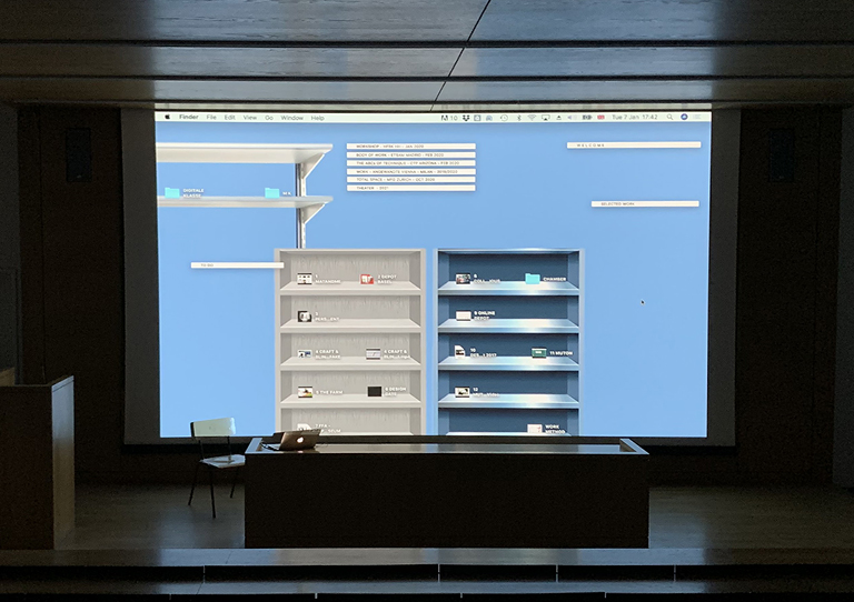
Musing #4: Gravity Doesn’t Exist on the Desktop: Back to Desktop Exhibitions and the relationship of the digital and the physical. I pretend that the desktop is my reception room; I treat it like a physical space. It changes a lot depending on the work I do, but my standard reception room has two shelves, in which my folders and files all have their place. I use the Sticky Notes app like Post-Its that I can expand. There’s so much room to provide an idea of a place. The natural laws of physics need not apply—gravity doesn’t exist on the desktop. You can develop your own geography and topography. You can slide or teleport. You create the rules and structure and change them as you go along. You do not pay rent or maintenance, and you take the infrastructure from your Photoshop skills. Still, we wonder: Does the digital have a materiality?
While I Was Scrolling Somewhere Else
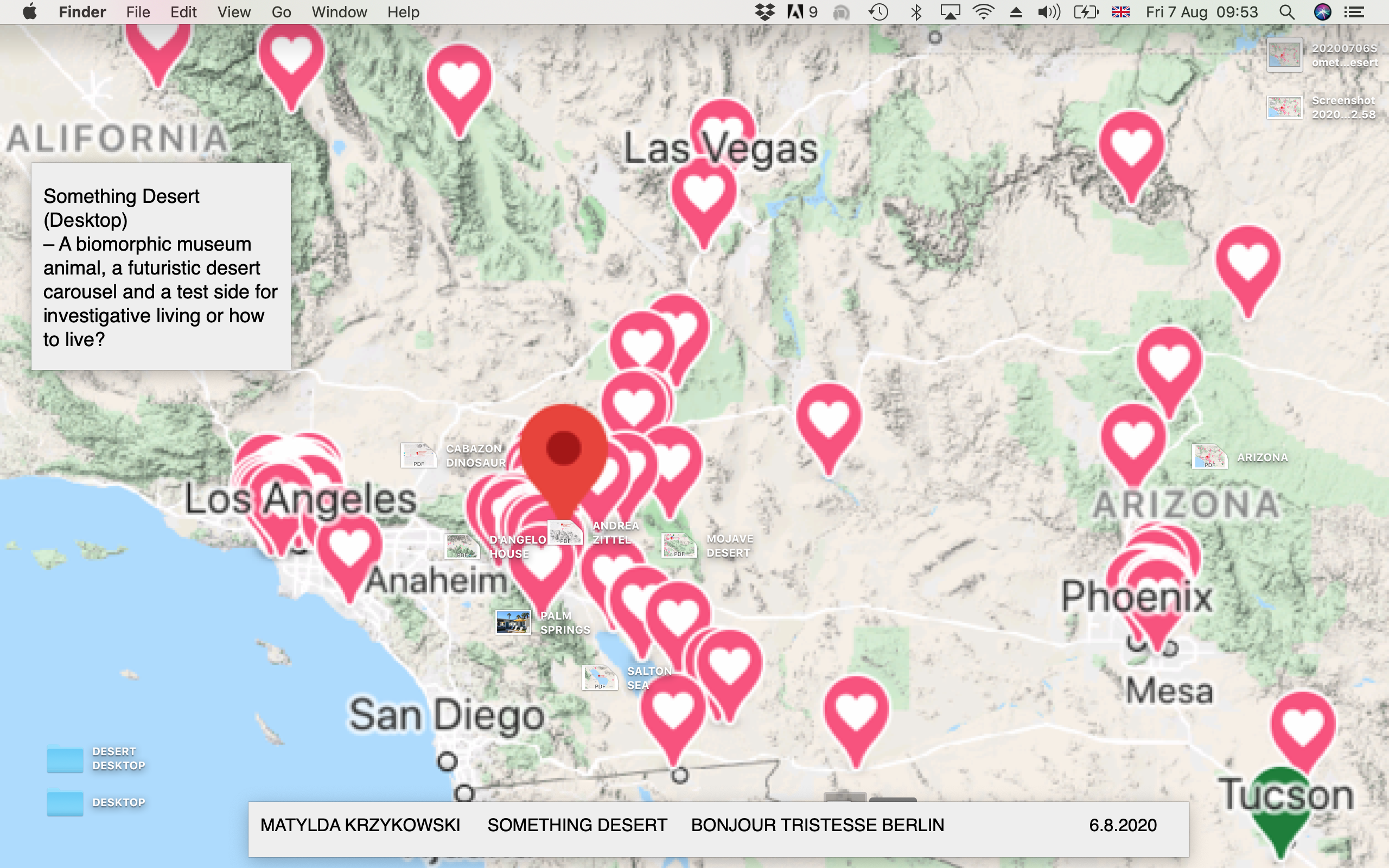
Desert Desktop was the title of the Desktop Exhibition I conducted on the rooftop of Bonjour Tristesse in Berlin at architectural studio Something Fantastic’s invitation to “speak about my observations in the Californian desert.” A Google Maps screenshot, marked with the Google “favorites” hearts, was set on my desktop background. Various files were geopositioned accordingly—on Andrea Zittel’s estate, on the rotating D’Angelo House, on Cabazon, a building in the shape of a dinosaur. I clicked, opened, talked, and pretended to be there while I was scrolling somewhere else. Maybe the guests were there with me, too.
Elena Schütz of Something Fantastic said the following to me afterwards: “Desktop Exhibition feels like a natural presentation format. It allows spontaneity, and thus, to react to the audience. One can compare it to a studio visit. You meet someone at their workplace (desktop equals laptop equals workplace).” It makes me think that perhaps I took the rooftop guests on a trip that they could follow with their eyes “geographically” on an interface that they are familiar with because they use it every day. Elena added, “It is on point, because it combines various media: moving and still images, but you could also pull out an email or a map. It does justice to the way we work and live these days.” In an essay by art historian Jörn Schafaff (2018) titled “Your Studio Is Where You Are,” he references the post-medium condition (Krauss 1999), in which practitioners develop and invent their own medium for specific intentions. He also cites a passage by Allan Kaprow that I find fitting to our times: “With such a form as the environment it is patently absurd to conceive it in a studio and then try to fit it into an exhibition hall. [ . . . ] The romance of the atelier, like that of the gallery and museum, will probably disappear in time” (Kaprow 1966, 183).
The Desktop Is a Place Where Ideas Are Scrapped, Mislaid, and Drawn Raw in Form
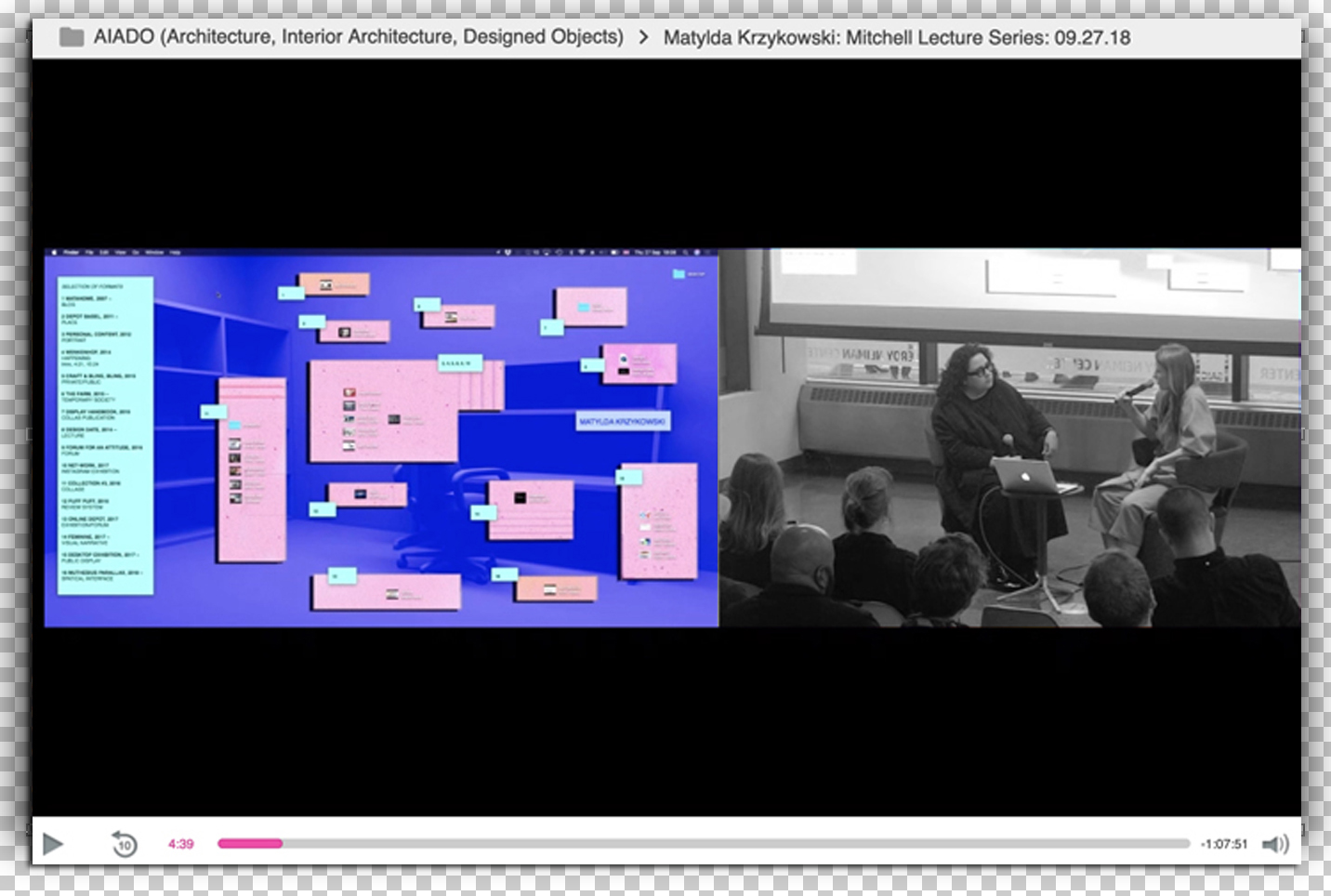
So, here I am, in a romance with the desktop. It is a condition to continue exploring. I was invited to give a lecture at the School of the Art Institute of Chicago, where I test-drove the Desktop Exhibition as a conversation rather than a presentation. Ilona Gaynor, a designer and professor at the school, sat alongside me while I conducted a Desktop Exhibition about the body of my own work. She has particular observations about this space, herself, which she shared in an email to me: “The desktop is a place where ideas are scrapped, mislaid, and drawn raw in form. It offers a short glimmer of real estate, where objects can do nothing but expand or be trashed.”
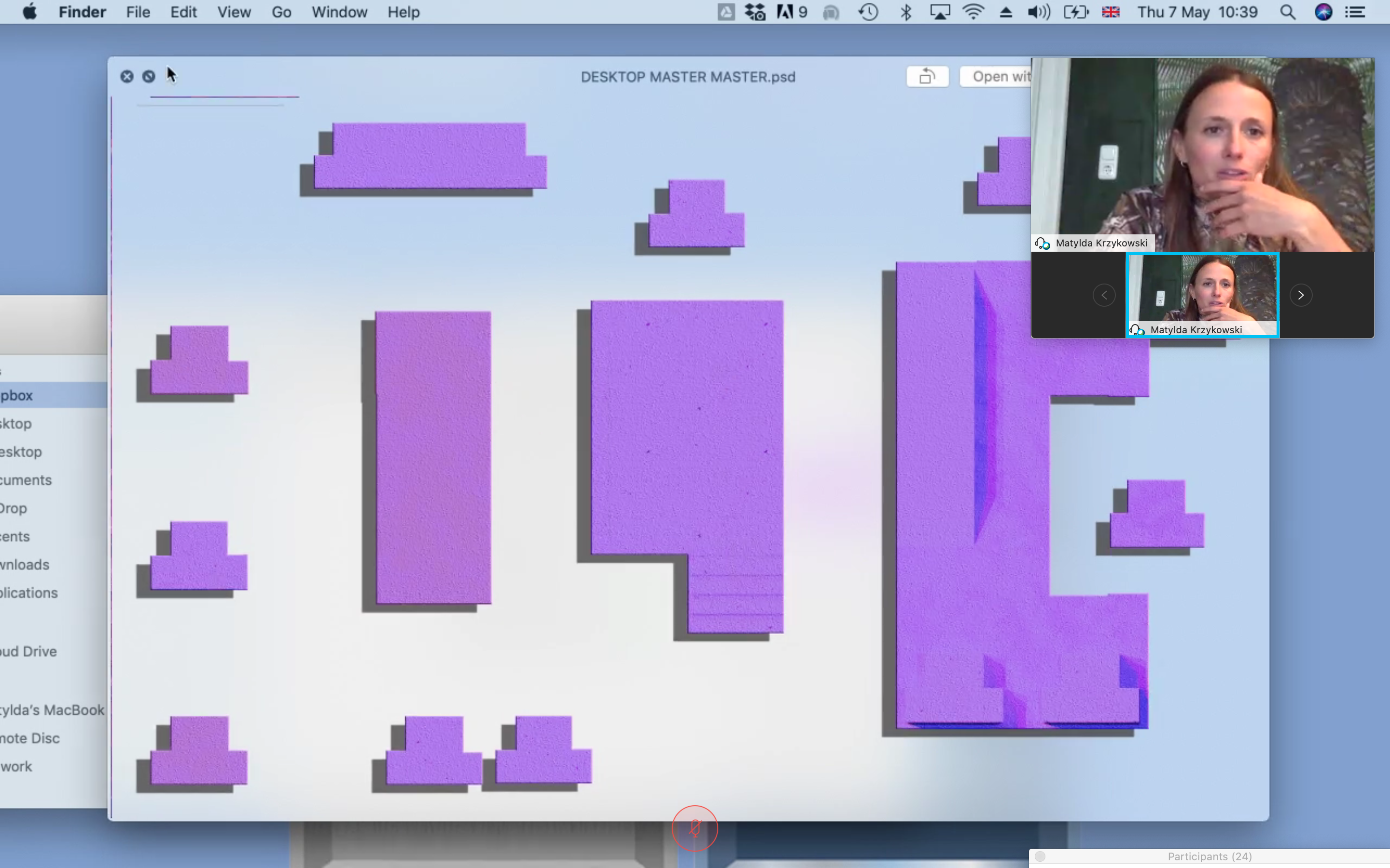
For this occasion, I prepared a “table of contents” on a Sticky Note. Throughout our talk, we strayed from it, came back to it, strayed again. This made it an open-form conversation theatre. It was as though we opened a drawer full of things and were not tied to an order in which to discuss them. We could decide to speak about everything or stop the conversation when enough had been said. A student, Tim Karoleff, compared us to the two old men from The Muppet Show. Our conversation had flow, it had self-irony, it was awkward at times but generated pronounced ideas. Much like the nature of conversation, the Desktop Exhibition has flow. The desktop itself is fluid: everything can be weightlessly moved, reshuffled, regrouped, deleted, Ctrl-Z’d. It can appear and disappear. The whole time the audience saw everything I prepared as thumbnails, and they watched as I moved from exhibit to exhibit, from work to work, and took them along with me. As a curatorial format, just like the tool/workshop/exhibition space I was presenting on, the Desktop Exhibition uses the transient nature of dynamic show-and-tell to its advantage. Ilona touched upon this relationship between desktop-as-tool and desktop-as-space in her email, as well: “The Desktop Exhibition makes use of the nomadic tooling of the designer, as a critique of a forum that works too hard to conserve its litany of demands. The temporal nature of exhibition is already a constant, in objects isolated from context, hoping to speak to an imaginary audience that we like to believe is both politically consistent, yet knowledgeable to design’s short, but authoritative, epistemological traps.”
I Have Been Dragged into a One-to-One Relationship with My Computer
Writing this essay made me revisit various moments and references when my conscious relationship with my desktop began. In 2016, graphic designer and editor Hendrik-Jan Grievink invited me to the graphic design department at ArtEZ Institute of the Arts in Arnhem as “crit” (reviewer and critic of students’ work) for the finals. In this department, students are challenged to think of graphic design not only as two-dimensional output but also as performative, spatial, or artistic work. The program focuses on the idea of collaborative and individual design-driven research and research-driven design. As a result, I saw an array of work that expands the classic, outdated connotations of graphic design, and I encountered unexpected results in both content and form. One of them was an eleven-minute-long desktop film by Valerie van Zuijlen that, with its layered, moving imagery, combined with AI-voice-spoken, poetry-like surrealism, is simply mesmerizing. “I have been dragged into a one-to-one relationship with my computer. Day after day after day I look into the window,” she writes, “a window that acts as an electronic mirror of my physical environment, where elements from nature are translated into a digital realm with its very own standards” (2016). This piece of desktop cinema is an endless, unconscious scroll. Maybe a commentary by proxy. Or a successfully captured spirit that exaggerates the back-alley culture of the desktop.
Dieuwertje Luitse’s method of presentation is one of the examples I mention most frequently not only to my students but to anyone else who’ll listen. When Dieuwertje walked into the classroom where fellow crit—Rick Paynor, professor of design and visual culture at University of Reading—and I were waiting for her, she nodded at us, opened her laptop, and showed us four video files where she had recorded herself within the frame of a movie about each of the four works. On screen, on the desktop, she spoke flawlessly about what she had done. Her presentation was precise, and it seemed to perfectly fit her. Rick wasn’t amused. In his understanding, a student needs to be able to present the work live. I, by contrast, was beyond pleased. In my understanding, a student, or anyone else, needs to find a way that works (for them). What you do is literally make it “work.” Make it YOUR work. That day I asked Dieuwertje if I could invite her to produce a series of seven videos for a Depot Basel format we called “Net-Work,” in which we gave contemporary practitioners access to our Instagram account and paid them for the online work they produced.
Despite my fairly recent but intense romance, teaching online used to be a drag. The shift happened once I introduced the Desktop Exhibition in my Show Your Work workshop, in which I annually prepare the students for their final exhibition at the MA Design department at Bern Academy of the Arts.
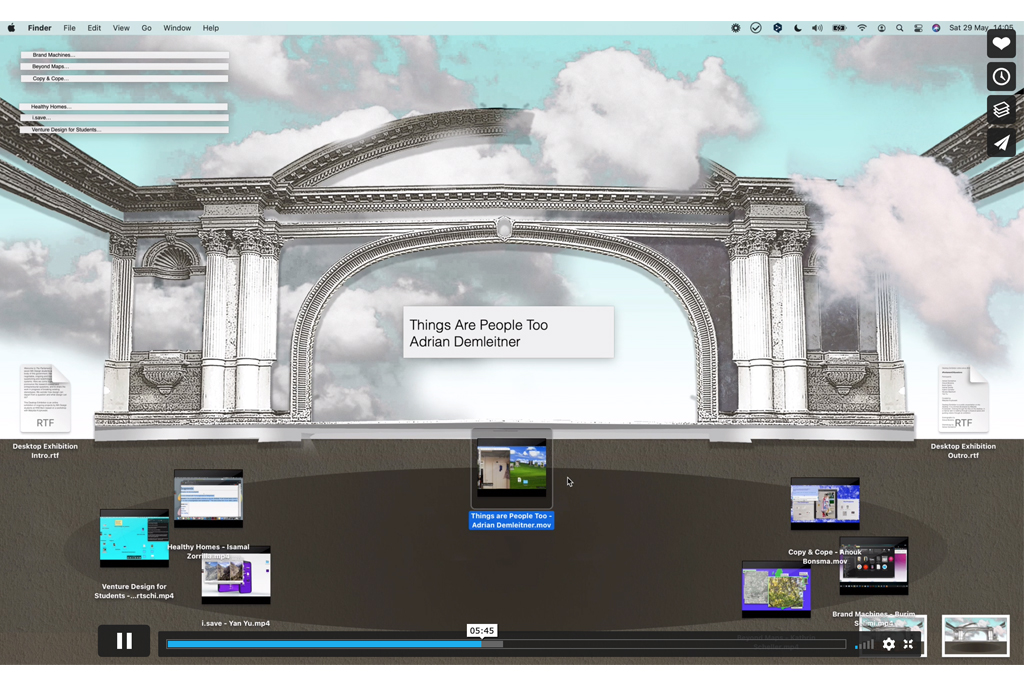
After each student worked on their individual desktop presentations, which they filmed by screen recording, Adrian Demleitner, one of the students and a software developer in the digital humanities, developed the dramaturgy and choreography for the entire Desktop Exhibition. Ordinarily during a crit, presentations may or may not adhere to a predetermined sequence, the duration of the presentations and crits varies, there’s fiddling with HDMI extensions and chargers, someone’s device doesn’t work, the dog ate someone’s homework. In this case, Adrian produced Ordnung for everyone who was part of the production. He later noted in the student group’s Slack that “developing a desktop-based choreography is a somewhat weird activity, akin to playing with puppets in a puppet house. You are at once the choreographer and the actor, the stage and the viewer. You are alone, which is quite different to many of the digital real-time collaboration practices of late.”
As with movement of any kind, a sense of space is inferred. I talked before about the desktop being a bit like a stage, and in this case, the students intentionally turned it into one: The Parliament of Questions. A parliament is a governing body, and a governing body needs a house. A house of parliament, a House of Commons, a House of Lords. In such spaces (typically) there is order, there are rituals, there is etiquette.
After Lockdown-Induced Zoomification Enforced Rigid Neatness
In this digital space, the rituals were choreographed—some taken from AFK life, some imagined. This allowed for both rigor and playfulness. As Adrian put it in our Slack exchange, “The exhibition space, two dimensional and flat, unfolds into your mind as you practice pushing the different media and symbols around the screen. It is also a very playful activity; I’m not used to imagining icons as props, stages, or doors within an exhibition. Animating them, by hand, frees them of their professional constraints. I was almost able to appropriate my desktop again, after lockdown-induced Zoomification enforced rigid neatness.”
Transporting the Physical into the Virtual
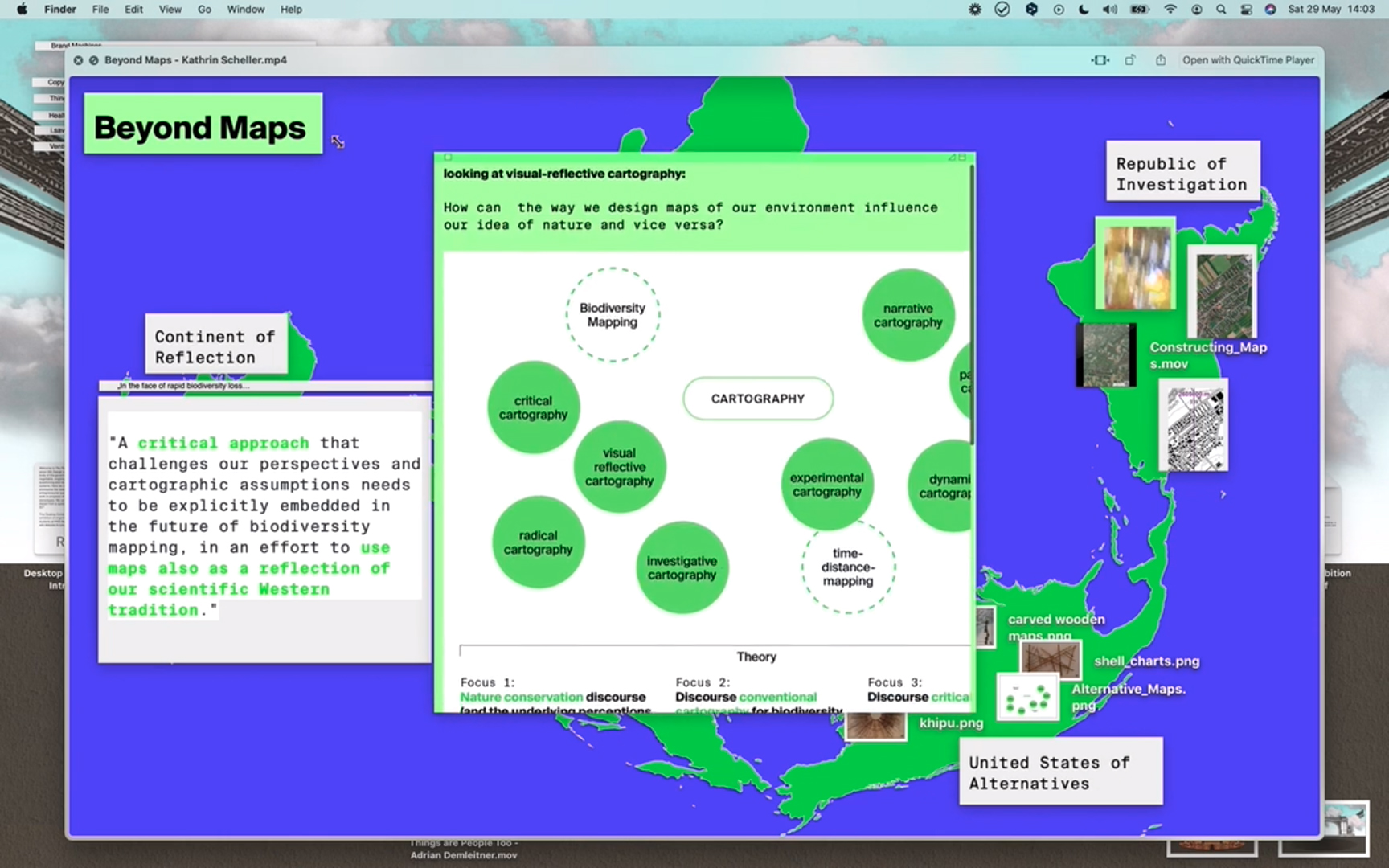
With any movement of the body comes expression and character. Scrolling is gesticulative. The motion on a desktop can also come with gestures. At that same workshop in Bern, student Kathrin Scheller tackled the idea of how our conception of nature is influenced by map design. Kathrin used the Sticky Notes app on the desktop in a way that gives the impression of unrolling a map. If you paste an image into a Sticky Note, it is pasted in the size of the image file. If the note is minimized, you can only see a small, abstract part of the image. Kathrin manually pulled out the corner of the note to maximize it, revealing bit by bit the bigger picture. As she wrote in Slack about her own experience of making a Desktop Exhibition, “the transformation of textual and conceptual content into a narrative based on visual representations and effects also helped me to look at my own project from a different angle, which in turn could positively influence my own process. In doing so, it was important for me to also transport the physical component of my research subject into the virtual space. I tried to translate the unfolding or rolling up of the map as a metaphor into digital space in order to establish a connection to the materiality of physical maps.” As with choreography, you move, you experiment, you learn with your body. With gestures, you’re learning with your hands.
This is the nuanced brilliance that happens when an element is translated rather than forcefully imitated. Sure, Kathrin could have filmed the unrolling of a map, but this is a tactile way of leaning into the tools available. Her approach made me think of Hendrike Nagel’s iYoga, which we exhibited and performed at the exhibition Users Are People at Depot Basel in 2016. As a group, we sat down in front of our laptops, following the hand on the screen, gesticulating with hands and fingers, like in a yoga session. The following appears on Nagel’s website: “As a mental update system, iYoga fuses our body, mind, soul, and technology. With a range of exercises, iYoga dissolves all boundaries between physicality and virtuality, humanity and technology, and opens up a new meta-physical dimension.” I noticed that right before reaching for something, in digital or physical space, you assume the shape of it. Hands are responsible for sending information to us.
As a Format Itself, Desktop Exhibition Creates a Place
Exhibitions often give things meaning. When you are in an exhibition, time unfolds in space through your movement, and you decide on your own narrative by approaching elements that appeal to you or intrigue you. In the role of visitor, you decide where to stop or where to come back again in the story you want to see. In the role of curator of the Desktop Exhibition, you decide where to stop or where to come back again in the story you want to tell the audience.
The format of the Desktop Exhibition organically came from a way that I have been structuring my digital space and from how I’ve been finding methods to communicate with my audience. I use my desktop as the main space, and from there I venture into other rooms, transforming the digital exhibition into a critical form. As a format itself, Desktop Exhibition creates a place. You are there with me. As Something Fantastic’s Elena Schütz said after the Desert Desktop presentation, “It gives the audience the feeling of having an extended insight into your material, references, and thoughts. It is rewarding to get an insight when listening to a lecture, but with the Desktop Exhibition, one actually feels like exploring something together with you.”
Simple Building Blocks Can Create Whole Worlds
This is a format that exists in a constant state of evolution. In that regard, I don’t know how it will continue to develop. An end goal would be limiting. What I am sure of is that the actual local and global place is your desktop. What I do know is that, particularly in education, it’s been a flexible tool to help students into a kind of fantasy abyss that they must experiment their way out of. It’s very far removed from the antiquated, Beaux-Arts idea behind how arts and design education started—the patriarchally imposed aim of reproducing some methodology—and instead encourages rather the opposite: empathy and experimentation. But of course, it isn’t a success for everyone. Perhaps the desktop is an ever-changing reception room of the present. Once you are done with the story, you close the laptop.
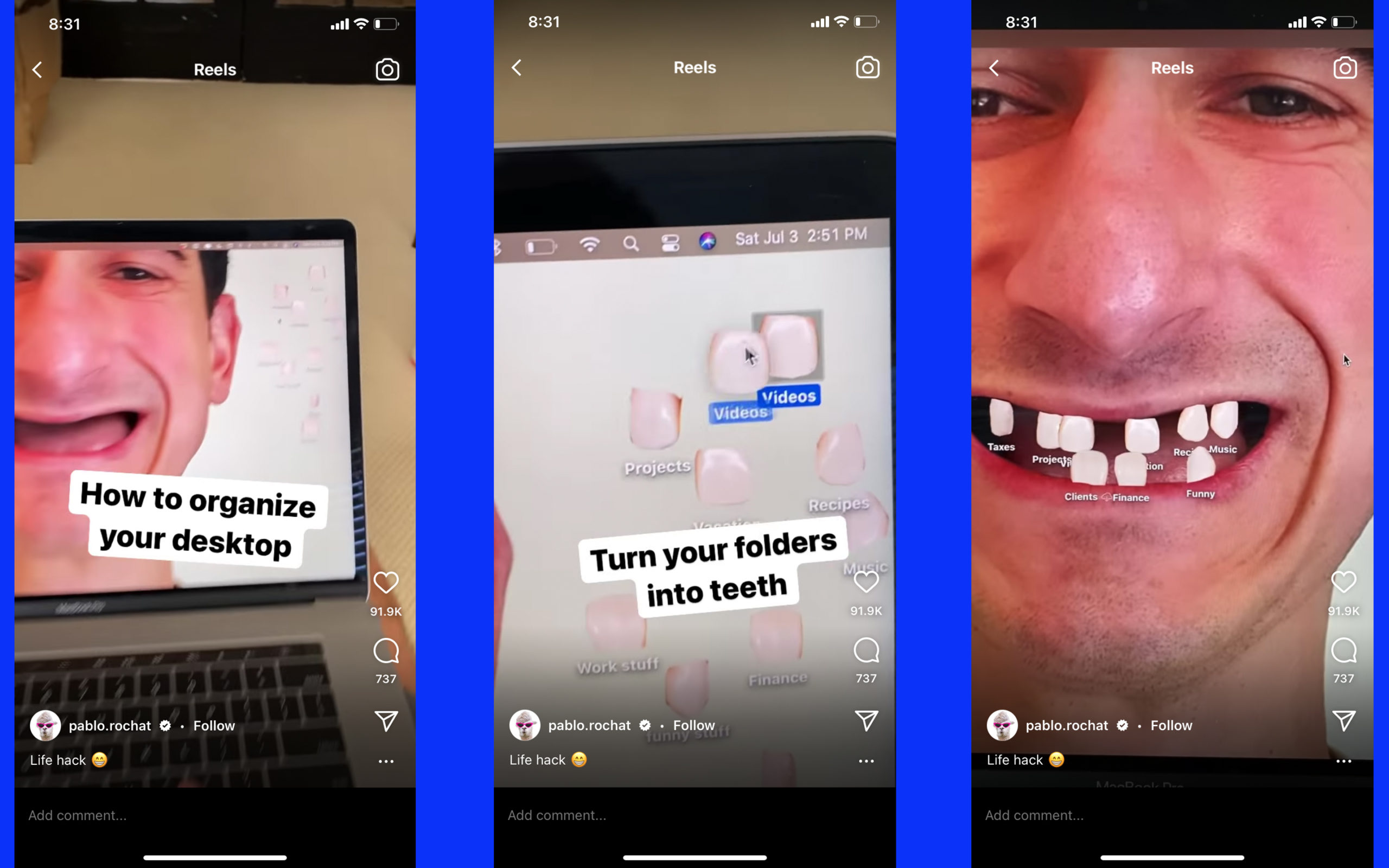
At the time of writing this essay, Desktop choreographer Adrian Demleitner sends me Pablo Rochat’s How to Organize Your Desktop, an Instagram Reel in which Pablo puts his toothless face on the desktop background and turns his folders into teeth. The Reel goes viral, spreading quickly to thousands of people online. The screenshot follows a not-fully-skeptical reflection and a suitable final commentary, which Adrian shared with me on Slack: “There are limits to how much you can produce out of the little that is present on or around a desktop: icons, media files, and wallpapers. Desktop Exhibitions will probably also not go far beyond a certain style of stop-motion animation. These constraints challenge creativity, and it might not be for everybody. Then again, along the lines of Lego or Minecraft, simple building blocks can create whole worlds.”
#DesktopExhibition #CuratorialFormats #OnlineFormats #ExhibitionFormats #ContemporaryProgramming #MatyldaKrzykowski
REFERENCES
- Christie’s n.d. “5 Minutes with . . . Marcel Duchamp’s Boîte-en-valise.” Features. Accessed October 5, 2021. https://www.christies.com/features/5-Minutes-with-Marcel-Duchamps-La-Boite-en-Valise-9416-3.aspx.
- Kaprow, Allan. 1966. Assemblages, Environments & Happenings. New York: H.N. Abrams.
- Krauss, Rosalind E. 1999. A Voyage on the North Sea: Art in the Post-Medium Condition. New York: Thames & Hudson.
- Schafaff, Jörn. 2018. “Your Studio Is Where You Are: Über Form und Funktion des Künstlerateliers im 21. Jahrhundert.” In Away: A Project About Residencies, edited by Alexandra Grausam, 260–268. Vienna: Verlag für moderne Kunst.
- van Zuijlen, Valerie. 2016. “Scrolling into the Deep.” Mister Motley. https://www.mistermotley.nl/valerie-van-zuijlen-artez/.
REVIEW
In “Opening the Digital Interior: The Infinite Display” the author introduces a unique practice of desktop curatorship. This emerging practice is inevitably appropriate in our present circumstances but also an intriguing approach to what we commonly know as/through physical interventions. The author introduces their technique through a selection of completed projects. These projects are presented one by one through screenshots that remain as documentation of live events, images from conference presentations featuring the work, and first-person written reflections by the author.
These reflections further render the method and explain the strategies involved. It is clear that the technique is thoroughly devised and expertly practiced. The author describes their technique as a translation of a physical curatorship that traditionally involves objects, symbols, interactions, and environments that meet a theme. This piece meets the criteria for Techniques Journal and clearly adheres to the aims and objectives outlined in the journal description. The creative component is clearly a significant contribution to the field of curatorial practice (and certainly has potentials to contribute to the discourse of spatial performativity).
—Nevena Mrdjenovic (she/her/hers)
