The Digital Blues: Animating Ecocide
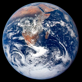
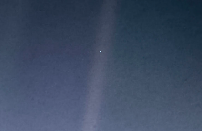
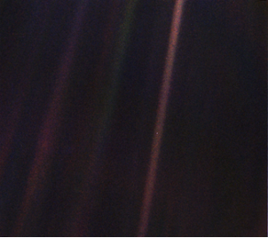
In 1972, Earth filled the frame as the “Blue Marble” and then receded to about a tenth of a pixel in 1990 as the “pale blue dot.” Both NASA images were symbolic, in their respective times, of the planet’s vulnerability in the vastness of outer space. The second image, taken by Voyager I, dramatically recalibrated our position to one devoid of dimensionality, nearly reducing us to image noise. Carl Sagan described the Earth at this distance as “a fraction of a dot” (2011, 6), a “mote of dust suspended in a sunbeam” (6), and, most famously, “the pale blue dot” (7). In more than just name, the color blue ties these two iconic images together in a persistent, ongoing cultural commentary about our distinguishing cosmic characteristic: blue makes the planet exceptional.
This point is argued by the Blue Planet series (2001), narrated by David Attenborough, followed thematically by Planet Earth I (2006), Planet Earth II (2016), Our Planet (2019), and numerous other spectacularly photographed portrayals of exceptional moments of life in animated form. In these wildlife films, blue is synonymous with water, which the world requires in order to create anything green, the color that has become dominantly metonymic for contemporary ecocrises. As far as I can trace back, “green” began galvanizing ecologically concerned protesters in the late 1960s with the “green panthers,” an early Canadian environmental group, and with Greenpeace in the early 1970s (Montgomery 2015). Calls for an expansion from the “green” ecologies into so-called “blue humanities” (Alaimo 2019; Jue 2020) are evolving responses to growing urgencies around our need to see the changing Earth.
Presumably moving images, like the documentaries already mentioned, capture our attention and focus it through color combinations that resemble a profilmic reality. However, what I want to consider here is how these colors reach us, in what form they zap our retinas, and if they have the capacity to denature, if not actually deanimate, the lives and living scenes being represented.
I hope the sky continues to be our primary source of exposure to blue. Recently the skies I have witnessed were hazy orange from wildfire smoke. And weeks go by when most of my blues come from the realm of computational space. Pure blue in the RGB color space tabulates as (0, 0, 255) and in the hexadecimal color-coding system as #0000FF. For a computer screen to be fully blue, every pixel, two million of them on an HD monitor, would be set to those digits.
Past Blue
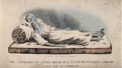
Blue, prior to the twelfth century, was considered cadaverous and barbarous rather than heavenly, soothing, or divine (St. Clair 2017, 180). It conjured death. For the human body, the color medically translates to asphyxia, hypothermia, necrosis, and silver poisoning. Deeply dehydrated skin also turns blue. Cholera can induce such a pallor in a matter of hours, earning the disease a variety of nicknames across its numerous pandemics, including “blue death,” “blue terror,” and “dog’s death,” in light of the rapid and horrendously dehumanizing demise (Watts 1999, 173). For the cyanotype photographer and botanist Anna Atkins, blue was simultaneously death and the irradiating sun. She documented the natural world in negative, marking outlines with ferric ferrocyanide or Prussian blue. Atkins would have been keenly aware of how her marine specimens must be plucked out of the water, quickly losing their vibrancy, in order to be recorded with scientific accuracy. Methylene blue, only visible in death, was also a necessary tool for scientists needing a fixative for microscopic stains: living cells refuse its entry and remain colorless; only dead, damaged cells will turn blue.
In 1928, geneticist Clyde Keeler studied mice that were missing photoreceptors responsible for vision. He found that blue light can be perceived even without functional rods (Keeler 1928, 361). His studies have led to a better understanding of circadian rhythms and how our bodies depend upon light to operate properly. This was an important part of the film Blue (1993), directed by painter and filmmaker Derek Jarman, who was losing his sight from complications from AIDS. Jarman could still see partially in blue, and he’d long been entranced with the idea of making a film about International Klein Blue (IKB), so he made a 79-minute work on 35-millimeter film that consisted of that single color. A curator at the Tate Britain, Andrew Wilson (2013), called the film “an elegiac journey towards a zone of immateriality.”
IKB translates to (0, 47, 167) in the RGB color space, if one can presume to convert a color to the digital realm when it originated as paint pigment. It has been suggested that the color’s creator, Yves Klein, died at the age of thirty-four because he’d been inhaling the chemicals that made the pigment so vibrant (Thackara 2017), not unlike the copper-arsenic mixture of Scheele’s green that caused many deaths across Europe as people sought physical closeness to representations of nature, ranging from fake flowers to leaf-green wallpaper (Kelleher 2018).
In the late 1980s, Microsoft coders found that their software lapsed into a vivid, solid blue screen when it failed. What became known as the “Blue Screen of Death” started as a glitch. But in Microsoft 3.0, it was incorporated into design: a failure screen was meant to keep errors from spreading. Rather than mask the issue, the blue screen alerted the user to a problem, stepped in as a gatekeeper to hold danger at bay—a computer overheating, for instance—and then offered a code to unlock the secrets behind the screen: a bug check, a kernel error, a point of analysis for the user. Digital blue was chosen as the color to keep us calm yet in touch, as gaming artist and scholar Evan Meaney wrote in an Atlantic article from 2013: “You sat there, by the dim light of your rebooting system, cursing your luck and the color blue all in one breath.”
Novelist and poetic philosopher William H. Gass (1975) said that blue, not meant for external expression, best suits interior life: “Whether slick light sharp high bright thin quick sour new and cool or low deep sweet thick dark soft slow smooth heavy old and warm: blue moves easily among them all, and all profoundly qualify our states of feeling” (quoted in Batchelor 2008, 154). In Bluets, poet Maggie Nelson (2009) collected 240 feeling-thoughts on the color blue, organized in a numerical order reminiscent of the propositions found in Wittgenstein’s Remarks on Color. In one entry, Nelson reminds the reader about Goethe’s dissection of colors. Blue, he said, may “disturb rather than enliven,” to which Nelson responds, “Is to be in love with blue, then, to be in love with a disturbance? Or is the love itself the disturbance?” (14-15).
Sightless Photoreceptors
My disturbance by and of digital blue began in 2014, as I was thinking about color temperature in digital moving images as well as the vast phenomenological difference between the physiological effects of being exposed to emitted light versus projected light. I made a film shot into the face of a defunct tablet screen, which acted as a “black mirror,” producing a dim but highly legible reflection (The Lanthanide Series, 2014). But I also became interested in wavelengths of light being emitted by digital screens of all sorts.
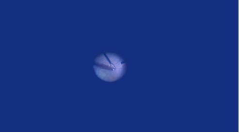
I made a color-coded series of films, RGB+K, considering the materiality of the digital image. The first was a “blue” retinal film (A Net to Catch the Light, 2016), followed by a “green” heredity film (Inside the Shared Life, 2017). Then came the “black” film focused upon a colony of mealworms (Tenebrio Molitor, 2019) and the “red” film (Heart (Radical 61), 2020), which engages algorithms for randomizing pixels, sometimes in selective fashion, as below in a red color shift. The “blue” film begins and ends with footage of retinal surgeries in echo of Jarman and his failing eyes. It also considers the physiological consequences of staring into the emitted blue light of computer screens.
Focusing on RGB also allowed me a way to access some of the recent studies on effects of various wavelengths of light on our bodies. For instance, green light may be able to treat pain, notably migraine headaches (Stone 2019). Red-light therapy has become commonplace to treat scar tissue and wrinkles. On the opposite end of the spectrum, light has the capacity to mutate and even kill cells. In a study from 2014, fly larvae were killed just by shining blue light, in the range of 440–450 nanometers, on them; its title conveys the story: “Lethal Effects of Short-Wavelength Visible Light on Insects” (Hori 2014).
Insects factor into A Net to Catch the Light and many of my other films; in fact, they have been my ethical answer to putting life on screen. From Rachel Carson’s Silent Spring to the onslaught of colony collapse in honeybees, the entomological have long been indicator species for us, even memento mori, keying us into ecological dangers. Yet they don’t readily suffer any effects at being filmed, individually, collectively, or on an ecosystemic level, as other nonhuman animals do. They also present more diversity than almost any other group of animals in shape, behavior, and dimension, not to mention color. Thus, in featuring them onscreen, I am attempting to disrupt a pattern of physiological and ecological violence that has been historically enacted upon nonhuman animals.
Virtual Color
In 1999, Rem Koolhaas wrote:
"[W]e have increasingly been exposed to luminous colour, as the virtual rapidly invaded our conscious experience—colour on TV, video, computers, movies—all potentially “enhanced” and therefore more intense, more fantastic, more glamorous than any real colour on real surfaces. Colour, paint, coatings, in comparison somehow became matt and dull. [ . . . ] It is only logical that, with the incredible sensorial onslaught that bombards us every day and the artificial intensities that we encounter in the virtual world, the nature of colour should change, no longer just a thin layer of change, but something that genuinely alters perception." (Quoted in Batchelor 2008, 220)
Today our perceptions of our planet are such that we expect to be dazzled. We look to narrators for answers, or we are prepared to be immersed in documentaries that allow us a window into a hard-to-reach habitat. We don’t often consider how long it took to capture a shot, how many people were employed, how many animals were disturbed, how many people were flown around the world in an extraordinary labor and environmental cost of capture. The carbon-intensive and ecologically damaging infrastructure is often forgotten.
The way in which we are wielding our cameras has become solipsistic. For nonhuman animals, the camera has become a literal obliterator: it can determine if a conservation case is deemed necessary, if it becomes a cause célèbre. The true hazards endured by images of the charismatic megafauna or “celebrity” animals are often undercut by their popularity on camera: studies have shown that putting animals, like chimpanzees, in commercials or onscreen outside of their natural habitat actually shrinks the public’s concern for their conservation (Schroepfer 2011). We assume they are protected; other people are caring for them. The danger of computer-generated images (CGI) may be even more detrimental to our sense of connection to the urgency of diversity conservation. Why should we protect something that looks brighter, shinier, and cuter in CGI rendering than it does outside, under a hazy sun? In some cases, CGI may allow for a gentler environmental footprint; however, the ethics of creating a fictionalized realm of wildlife might have even more deleterious effects on our understanding and empathy for living creatures.
Similarly, untrammeled tracts of land shown in gorgeous images on Instagram can bring a flood of tourists to previously hidden spots. Thus, protecting places and species often means putting down the camera. This has been suggested in broader terms by Rasheed Araeen, who has advocated that artists need to “abandon their studios and stop making objects” (2009, 684). Viewers and artists share a burden of guilt. We are all involved in experiencing and documenting landscapes, wildlife, and the increasingly degraded environmental status of the planet today in the Anthropocene. Yet many makers, professional and amateur, have swapped their handheld or even helicopter-held cameras for drones, losing even more of a sense of embodiment. The drone’s alien view often puts us in a place of distance—looking back at the Earth as if we’re aboard Voyager I, abandoning this planet or at least never returning to a position or state of mind in which to examine with empathy or from a shared vantage what’s been seen, as people once did with the Blue Marble and the blue dot. The irony is that as soon as we see everything, we see nothing.
We’re facing all sorts of planetary Blue Screen of Death warnings: visual reminders that the complexity beyond is vast, that an error has been detected, and that we need more carefully considered evaluations of what we’re seeing. In an age of environmental upheaval, cameras have the power to be turned against nonhuman animals as their screen representations accelerate the conversion of their ontological status. A single image can unpredictably sway public consensus and action; just as a slew of images can overwhelm and benumb us. So, conservation may now require a reexamination of looking itself: if and how will we document the still-extant animals, places, and spaces on screen; with what technics; with what colors? As ecocide scales up and computers interpolate errant pixels into oblivion, blue may morph from our planetary exceptionalism into “dog’s death” discoloration, a return to a rampant, sickly blue.

